02%
Hotel partners on Expedia's platform struggle to anticipate demand spikes caused by local events. This results in:
- Missed revenue opportunities: Partners weren't pricing dynamically for high-demand periods
- Poor guest experiences: Hotels were unprepared for sudden demand surges
- Competitive disadvantage: Hotels that knew about events could outperform those that didn't
I started by reviewing the requirements with my Product Managers and Business stakeholders.
The goal was to help revenue managers make informed pricing and inventory decisions by surfacing relevant local event data at the right time. At the same time, wanting to improve the quality of Expedia's hotels supply, our Business Partners requested we made the functionnality only available to hotels with a high quality score which we needed to make clear to users.
As my assigned UX Researcher was unavailable at the time, I took advantage of our team's extensive existing research on hotel revenue management. Previous studies had already explored how partners make pricing decisions and respond to demand fluctuations, providing valuable context for the project.
Notably, though partners knew about big local events (think pop stars concert or football matches), they were often missing on hyper local smaller ones like niche conferences that attracted crowds looking for a hotel room. Concerning pricing, they often relied heavily on gut feeling rather than data.
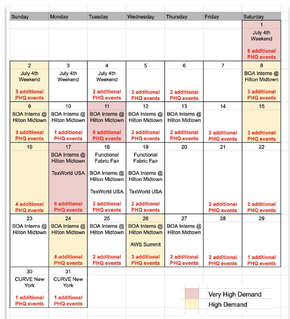
"I don't need to know about EVERY event. Just the ones that will impact MY hotel."
02%
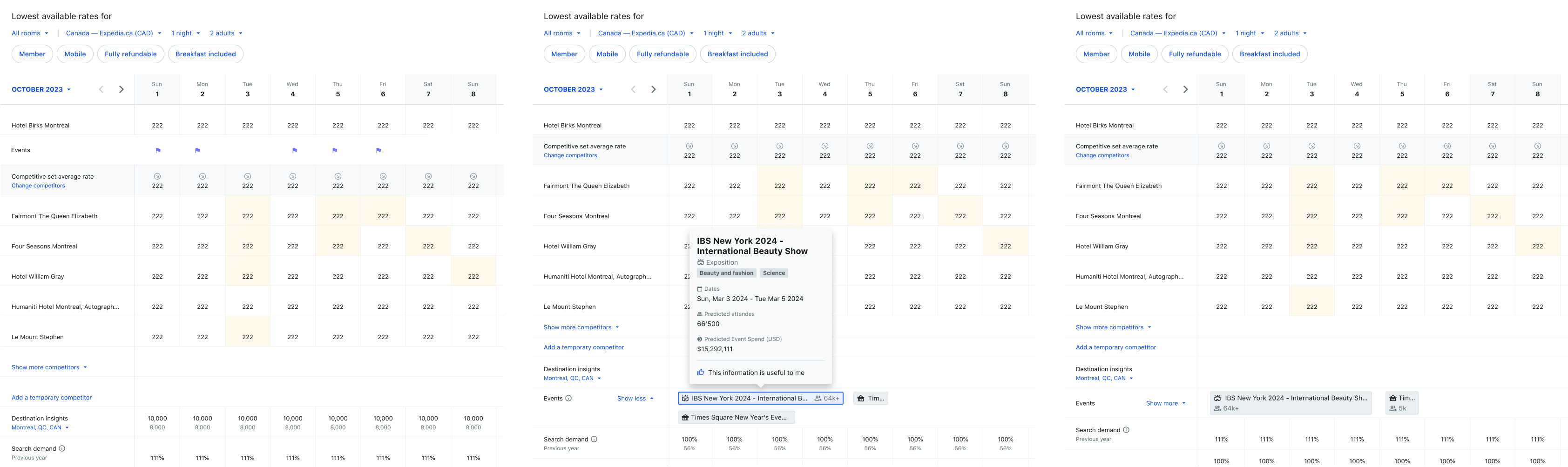
The core design challenge: Events exist in time, but how do we display them spatially in a revenue management dashboard?
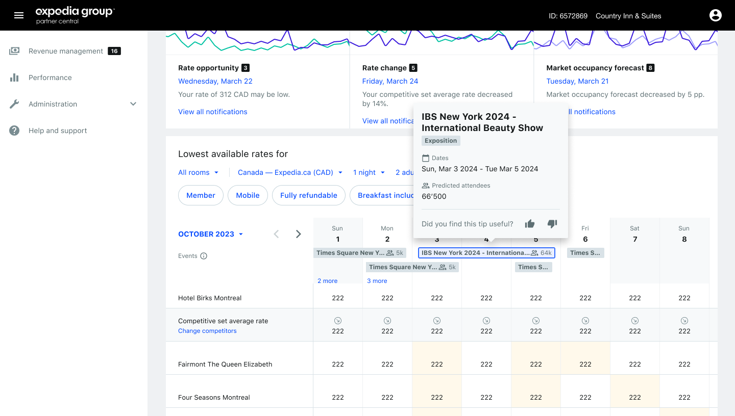
I thus explored multiple approaches from the most simple one simply letting users know there was an event happening and having them dig deeper into a side-panel to know more to more complex one even showcasing the event type and predicted attendees.
02%
I started sharing my design to the XD team and wider.
First taking it to our local crit and then bigger XD roundtable, I gathered feedback on accessibility and readability. Then, after a round of technical reviews with my engineering peers in Shenzhen, we discovered that a timeline view would be difficult to fit technically into the existing grid.
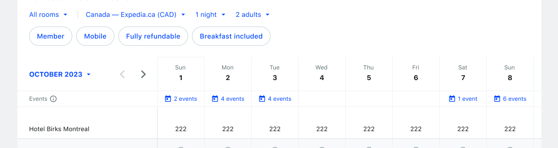
We thus decided to split the release into two milestones. First, prioriting speed to honor our contract with the event provider, we'd release a first version simply showing the number of events for a day and then expanding to the timetable view.
At release, I starting using the Analytics tool I had put into place earlier in the year to track usage.
And the results were clear: Though we were seeing a clear increase in hotels' average quality score after encountering the tools which meant our goal of raising the supply's quality was working, there were a lot of usability issues highlighted in the data.
Notably, users spent a large amount of time opening each panel looking for the most interesting ones which was not a suprise knowing how the timetable view first envisioned better fit the users' mental model based on past research.
While I was gathering data, the development team was hard at work preparing the second milestone.
And thus a month later, the second vision of the experience was released including the timetable view. I also took the opportunity to enhance the experience based on users' feedback by adding a dynamic filtering which would only show events with a certain amount of visitors depending on both the hotel's submarket and capacity.
200%
After launch, the feature achieved strong adoption with measurable business impact that increased returning users by 2.3% and improved hotel quality scores by 1.5% through better demand anticipation.
Pauline Baeni
© 2026