02%
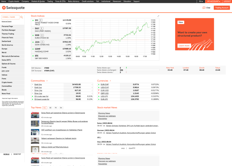
Swissquote’s homepage had not been reviewed for more than 20 years
While it was the most visited page of the site, it suffered from a low retention rate and a high bounce rate mainly due to the fact that users had trouble finding relevant information on the page and that the outdated design scared users as uncovered by a survey launched in 2022.
The Product Manager’s goal was clear.
To update this page with information more relevant to users and provide a UI consistent with the rest of the platform in order to increase conversion from the page and reduce the bounce rate.
While the Survey’s data received at the beginning of the project already gave me something to work with, I decided to gather with our User Research team and conduct interviews with 5 users to receive qualitative data on their current usage of the page.
“I use this page as a way to quickly check the latest market trends.”
The most important thing for users was to be able to have a clear overview of market trends in a glance.
It was also not clear for them if any of the products in the page were tradeable and some of the information was straight-up confusing. For example, we were providing different time zones in the world but this gave them no indication of market opening times.

Benefit of a redesigned page > Pain of getting used to it
As stated before, this page had not been touched for an extensive period of time. We knew from previous changes at Swissquote that a lot of long-time users had a hard-time with change. While a design might be dysfunctional, over the years, people grew accustomed to it. So no matter what we did, the gain of a redesigned page had to overcome the pain of getting used to it.
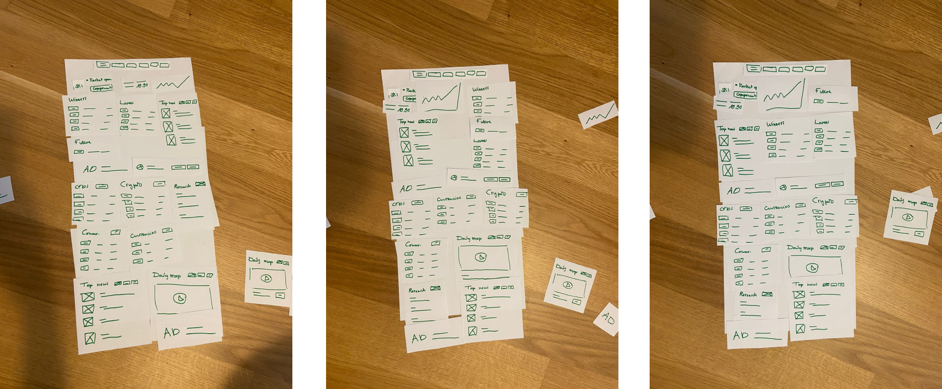
Now knowing which information we had to keep, drop or add, I met with the Product Manager and Product Analyst to make sure we were aligned on Business Goals and started working on Wireframes.
02%
I met with Engineers to present the design.
We discussed high-level feasibility of the proposed page mainly in terms of data accessibility. After that, I started iterating on some visual designs to start Usability Testing. It was a difficult task for me as the page was both part of the platform but also its storefront and could use a more ‘editorial’ style which is not something I was used to do as part of the Product Design Team at Swissquote.
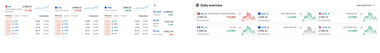
The part that when through the most iterations was the ‘Daily Overview’ which was a key part of our design.
I defined 2 metrics to observe for this part of our testing: The first one being how good of an overview people were able to see in 8 seconds, and how easy to understand it was. We were able to greatly improve our score by simplyfing the layout to make the scanning of information easier.
I kept iterating while staying up to date with the business requirements from the team and the feedback from our users.
We went through a lot of different proposals for this one single page, discussing it through team critiques and reviews to make sure we offered the most qualitative version to our users.
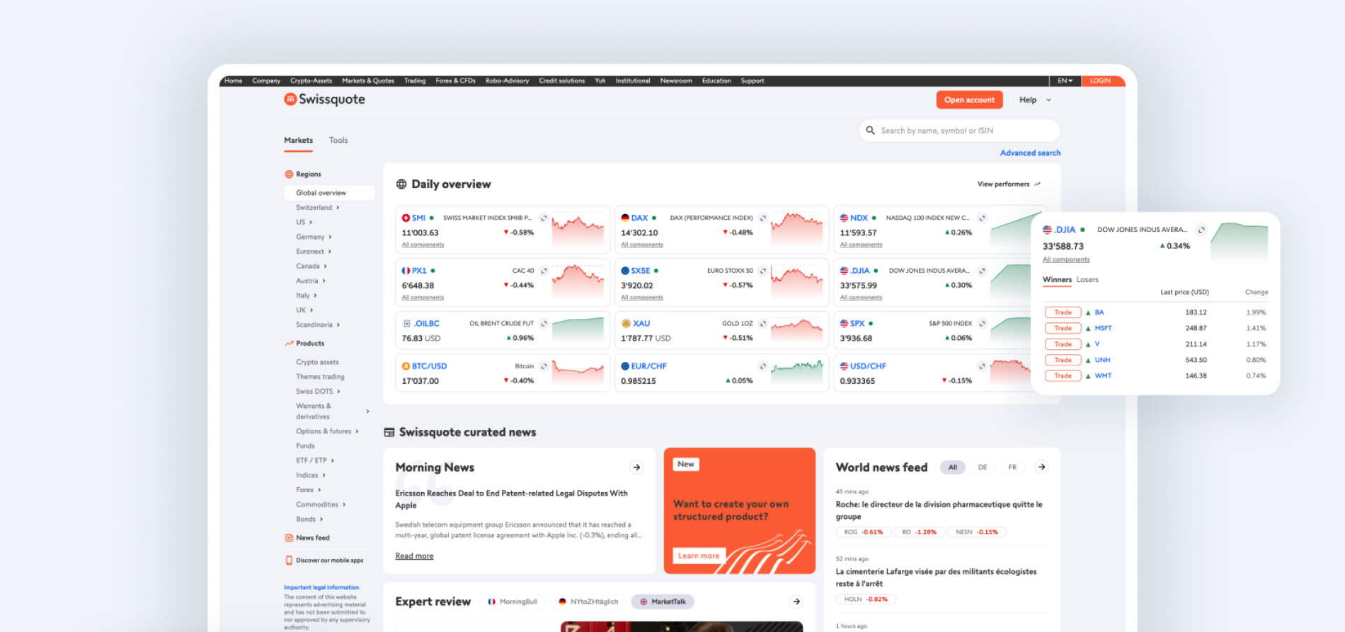
From the first version we tested to the last, the perceived usefulness of the page grew 15%.

200%
After launch, the bounce rate of the page decreased 18% QoQ and session time increased 40%. While this page was already the most visited of Swissquote, it also improved 20% QoQ in number of single daily visitors.
Pauline Baeni
© 2023